My phone is my ‘go to’ when I’m looking to do some on-the-spot research. If I’m travelling or waiting for something, the chances are I’m looking something up on my mobile.
I know I’m not alone here – we touch our phone more than 2,500 times a day on average, which is equivalent to around three hours of mobile browsing per day.
Sometimes browsing goes like this:
I land on a website that has content that fits my needs and is presented in a way that’s easy to locate and understand.

I’ll bookmark the page and revisit it later – where there’s a good chance my return visit will turn into a conversion, such as a phone call, personal visit or use of an enquiry form.
But all too often, it works like this:
I click on a website link and wait, wondering if it’s loading, then hit the back arrow, because I know there are always other options I can look at.

Speed and usability are important on all mobile devices (phones, tablets and laptops).
Unfortunately, these experiences happen all too often and these businesses lose potential customers due to the huge range of other options just a tap away. In fact, it takes less than three seconds for visitors to decide not to persist with a poor mobile experience. The beauty of the internet is that there are always alternative sites that provide the information you want in a way that’s faster, easier and more professional.
Being mobile-friendly is all about creating a positive user experience for people accessing your site on a mobile device.
It’s putting thought into what someone wants to see when they first go to your site, what they want to do and how they would use the site. It’s considering the hierarchy of needs – the information visitors want first – and making it easy to find and use that information in the first few seconds.
“40% have turned to a competitor’s site after a bad mobile experience.”
There aren’t many businesses that can afford to turn their back on 60% of their potential customer base. Yet, we know that more than 60% of New Zealanders own smartphones and more than 60% of web traffic is now from mobile browsing.
In fact, even as far back as 2012, a Google-led survey established that:
Five years later and the majority of web traffic is now coming from mobile browsing. That’s a massive segment that has come to expect the quality and speed of an app and will just as quickly leave, rather than put up with a poor website experience.
If you’re online to attract visitors to your business and want to convert those visitors into customers, there’s another statistic that’s worth noting:
“88% of consumers who search for a type of local business on a mobile device call or go to that business within 24 hours.”
Nectafy
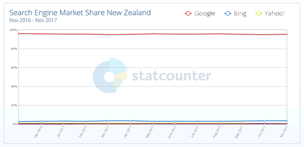
Achieving online success typically begins with how well you work with Google – after all they have a 95% share of the Search Engine market in New Zealand.
Google wants your website to be mobile-friendly, so it pays to listen – especially as the Google ranking algorithm penalises websites that are not mobile-friendly.
A poorly designed website can lead to low Google rankings, poor user experiences and ultimately low enquiries.
1/ Your mobile site needs to display elegantly on all devices
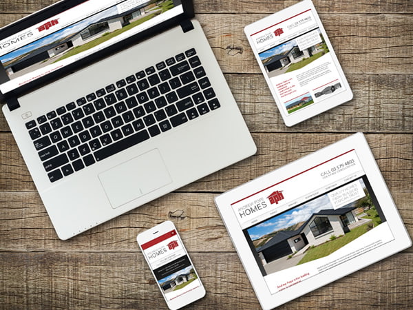
Your mobile site needs to render just as well on tablets and devices of all sizes as it does on a smartphone screen. There are so many mobile device sizes these days and your website should display perfectly on each of them. This is one of the advantages of a well-executed responsive design over dedicated mobile websites - read on for more information about this.
“57% of users say they won’t recommend a business with a poorly designed mobile site.”
2/ Focus on fast page speeds
Every second counts. The faster the mobile experience, the more engagement you’ll receive. Faster loading pages lead to a better experience for your customers as well as improved conversions. It’s so important that Google uses page loading speed as one of their ranking signals.
“53% of people will leave a page if it takes longer than three seconds to load.”
Yet 63% of the ‘designed for mobile’ sites we tested took over three seconds to load. Slow loading websites lose visitors, creating more opportunity for faster loading websites to engage those visitors.
3/ Keep it simple and clear
When it comes to designing for mobile devices, simple is better. Cramming content and resource-intensive items onto your site reduces the user experience. Content should be kept short and to the point, with your most important content at the top of the page, enabling customers to easily engage and flow through to your desired action or conversion – such as a purchase, phone call or online form.
4/ Provide intuitive navigation
The ease with which you can find your way around a website is the foundation of a good mobile experience. This starts with your website navigation, which should be both simple and familiar; it should load instantly, be straightforward to use, have a clear menu structure and be found in an expected location.
5/ Clear call to action
A smooth user experience makes for better engagement. One of the best ways to make browsing easy for users is by using clear call to action buttons, such as ‘view our testimonials’. Buttons should be designed so that large and small fingers can operate them easily, and it should be clear what they do.
6/ Make it easy to contact you
Make it easy for existing customers and potential new business leads to get in touch with you. Keep contact information easy to find on every page and make it clickable, for example a big ‘call now!’ button. Contact forms and maps should also be easy to use and responsive on mobile devices.
7/ Avoid pop-ups
How many times have you left a website because of those annoying pop-ups that block out most of the screen on your phone? Google research indicates that intrusive pop-ups make for a poor user experience, so websites with mobile pop-ups get penalised.
The type of website you have will either limit or support your capacity to be mobile-friendly.
Desktop-only websites (common in 2000-2011)
This is the way things were done many years ago, when only one website was needed. Websites were designed for desktop computers only and not made to be mobile-friendly. Smartphones will display this kind of website, but they provide a poor experience for customers, as users will have to scroll and zoom in an effort to see content.
PROs
CONs

Mobile-dedicated websites (common in 2011-2013)
Mobile-dedicated websites are separate websites that run alongside a desktop website. They rely on the ability to detect what type of device a customer is using to view the website. Google describes this solution as ‘error-prone’ as it can degrade a website, creating a poor experience for the customer.
With such a large variety of mobile device sizes on the market, it’s a solution that isn’t particularly mobile-friendly as it’s only been designed for two sizes and has significant downsides – both in search and in content maintenance.
PROs
CONs
Responsive websites (the current standard 2012-2025+)
Responsive websites are sites where visitors can use the whole website on their specific screen size. Content responds without delay, adjusting to display elegantly on any device. When it’s executed well, this kind of website gives visitors the best online experience and creates the best opportunity to convert visitors into customers. Responsive design is Google recommended and has the most benefits.
PROs
CONs
“Google recommends webmasters follow the industry best practice of using responsive web design.”
Being mobile-friendly influences whether your website is attracting new business or sending new business to your competitors. If you’re not sure how mobile-friendly your website is, we can provide a free appraisal that includes all the aspects of delivering an awesome mobile-friendly experience.
